

Hear With Me
About the brand
• patient-centred
• empowering
• caring
• approachable
Hear With Me is an audiology practice with a strong community and patient-centred focus rather than a sales approach. Key elements of the brand are to be friendly, good-humoured and accessible. While being young and modern Hear With Me takes a professional and process-based approach. Hear With Me will take the time and listen.
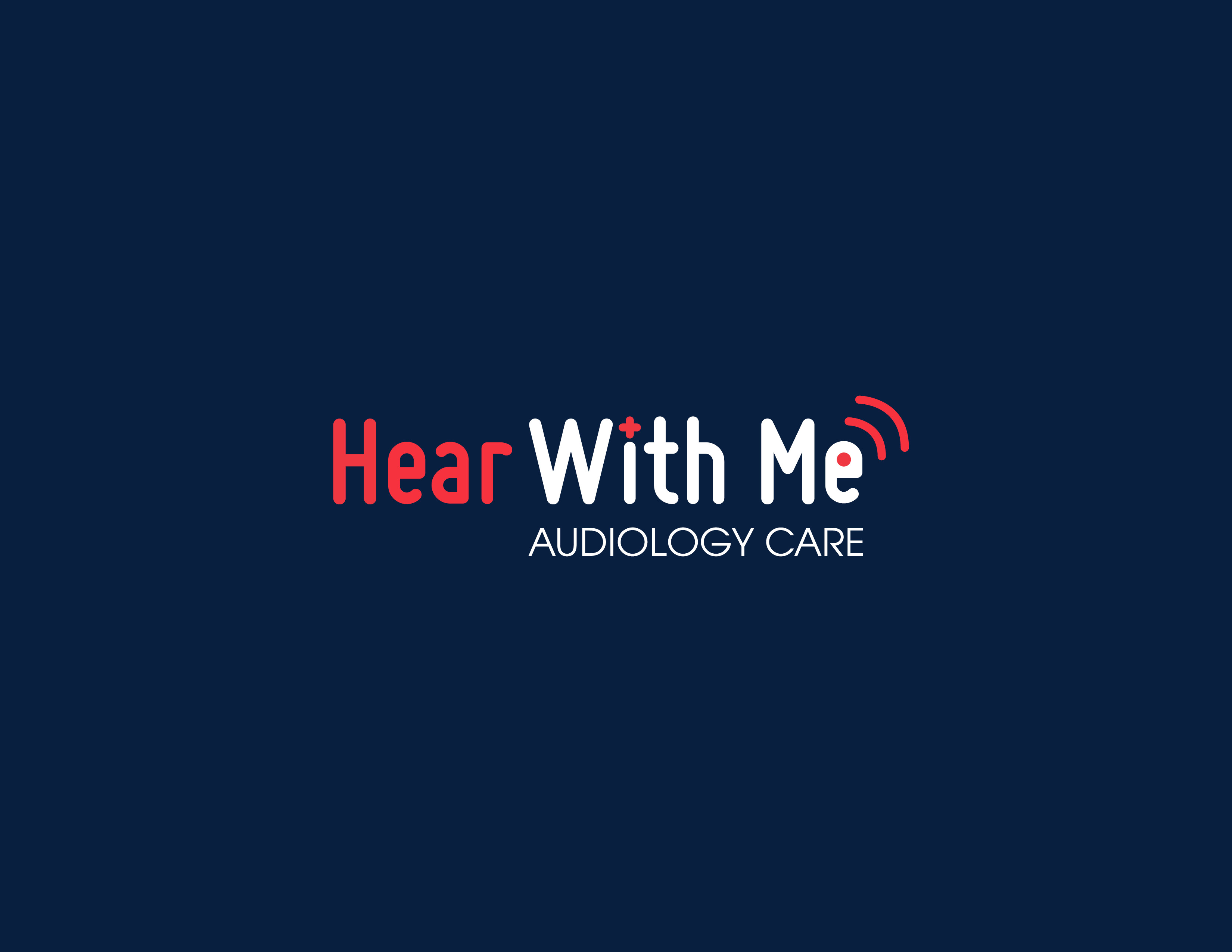
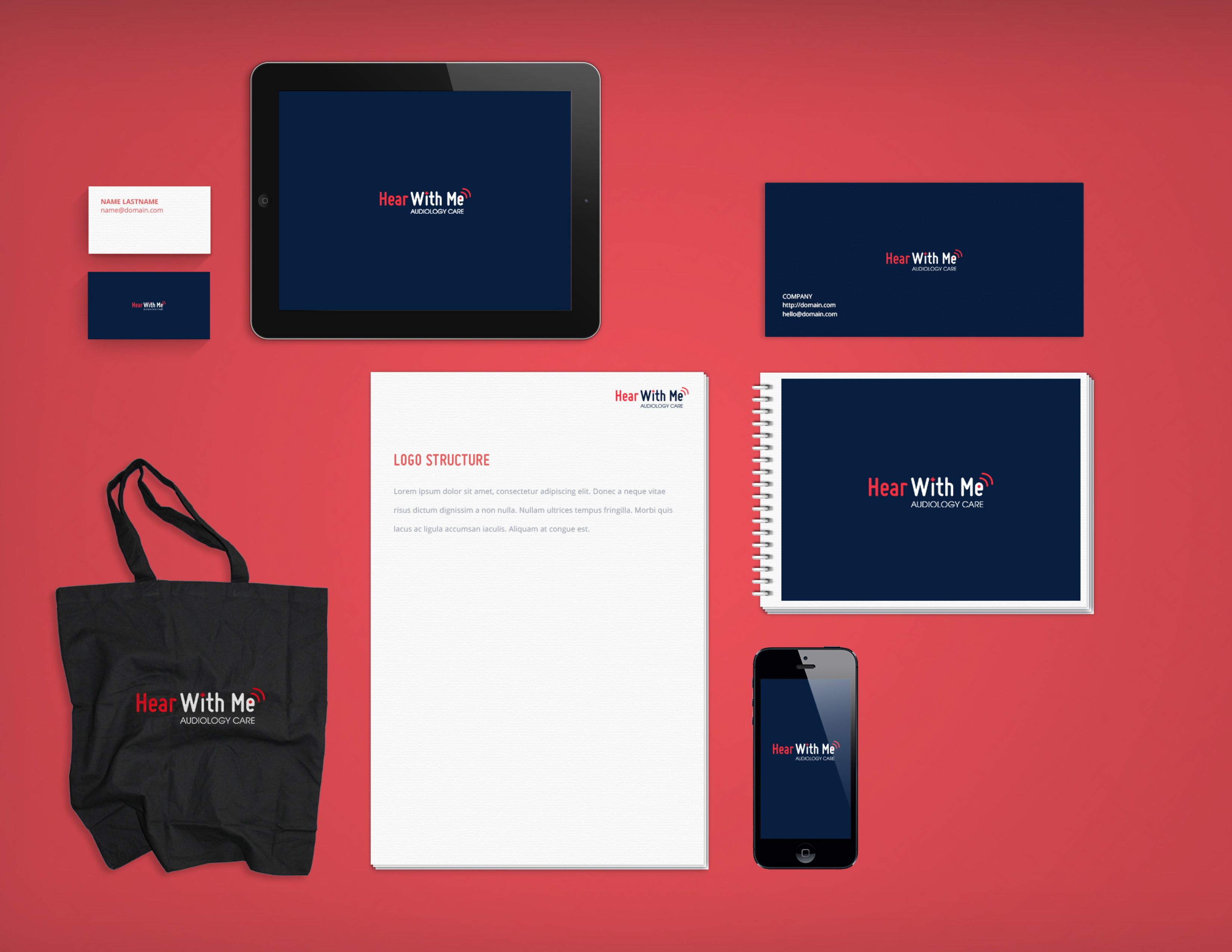
Logo
The logo design is simple so it is clear and easy to read. The dot on the i has been turned into a plus symbol which is an icon commonly connected with healthcare and has also been used as a universal symbol for volume increase. The letter e has also been customised to represent an ear. The use of a sans serif soft rounded font is to emphasise the personalised and friendly feel of the brand.
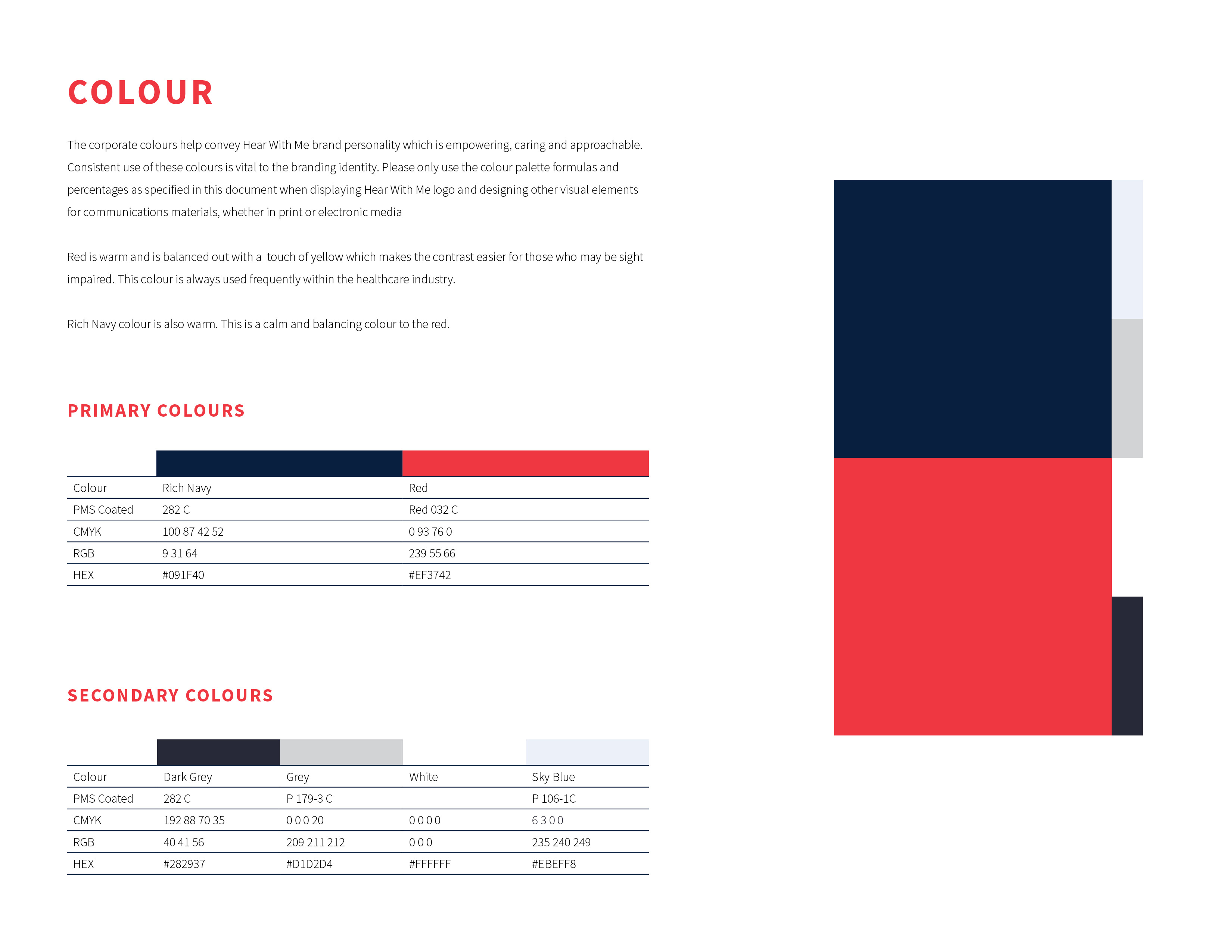
Colour
The corporate colours and branding help convey Hear With Me brand personality which is empowering, caring and approachable. Red is warm and is balanced out with a touch of yellow which makes the contrast easier for those who may be sight-impaired. This colour is always used frequently within the healthcare industry. The Rich Navy colour is also warm. This is a calm and balancing colour to the red.